How a COVID-19 timeline drove subscriptions for the San Antonio Express-News
Randi Stevenson, Joy-Marie Scott and Chris Quinn, San Antonio Express-News,This is a series on Better News a) to showcase innovative/experimental ideas that emerge from the Knight-Lenfest Newsroom Initiative and b) to share replicable tactics that benefit the news industry as a whole. This “win” comes from Randi Stevenson, executive producer; Joy-Marie Scott, engagement analyst; and Chris Quinn, senior digital content producer; all at the San Antonio Express-News, which was part of the 2019-20 Poynter Local News Innovation Table Stakes cohort.
Question: What problem were you trying to solve, and why was solving the problem strategically important for your organization?
As the COVID-19 pandemic escalated across San Antonio and Texas and the United States, we found ourselves with a massive amount of stories, information, data, government announcements and changes in the law.
The challenge: How do we present this information overload — a crucial public service for our community — in a way that’s easy for readers to understand and digest? If they visited our site, we wanted them to have a one-stop shop for all things COVID-19 in San Antonio.
That was important because, like most publishers, we had a massive influx of users on our site, many visiting for the first time.
We also needed a way to compete with — and complement — our non-paywall sister site, mySA.com. The free site has a history of quick, easy, utilitarian content; ExpressNews.com is paywalled and known for longform, in-depth analysis. But we knew that if we didn’t offer useful, relevant content on ExpressNews.com related to COVID-19, we’d risk losing audiences to the free site.
Enter: The COVID-19 timeline.
Q: How is this approach related to Table Stakes (e.g. one of the 7 Table Stakes and/or an outgrowth of the Knight-Lenfest initiative, etc.)?
This effort is related to Table Stake No. 3 (Produce and publish continuously to meet audience needs).
Q: How did you go about solving the problem?
As your fifth-grade teacher might say: Keep it simple.
The ideation and development was by all accounts a group effort. We took inspiration from fellow Hearst newspaper the San Francisco Chronicle, which had a similar timeline up and running early on in the pandemic. As a digital team, we decided what assets we could include and how/who would program it.
As for what tool we’d use to build the timeline, we needed an efficient, reliable program that everyone on the staff knew how to operate (nothing with heavy code, etc). Ultimately, we built it using a standard article template within our own CMS. We’ve since advanced our technique a bit with other timelines using this Google Sheets model. Still, nothing compares to the ease of the article.
Our audiences needed day-by-day updates during the coronavirus crisis, to help them navigate the “new normal.” They had a lot of practical questions: Do I need a mask to go grocery shopping? Can my kid go to school? The timeline provided answers to critical questions in real time, as government officials announced changes.
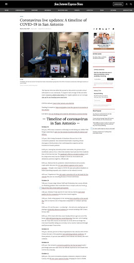
A screenshot of the ExpressNews.com COVID-19 timeline.
The timeline format was a natural fit for the daily — sometimes hourly — updates. The timeline allowed for short blurbs with need-to-know information in chronological order, with timestamps and links back to the full story. Often the timeline would be updated with breaking news before the full story came out (in which case, we’d add the link later).
The timeline was mostly reserved for news and announcements: daily COVID-19 case counts, hospitalizations, new or updated stay-home orders, testing site information, etc. We didn’t include features, obits and the like.
The timeline was free, but any linked stories were subject to our standard meter. The goal was for readers to sample stories in the timeline but ultimately to hit our meter when they wanted to read more.
We’ve promoted the timeline on our site nearly 24/7 since launch, usually in a breaking bar that lives at the top of the homepage and articles. We’ve also linked to the timeline from at least a half-dozen newsletters and regularly (at least early on) from our social media pages. We continue to link to it heavily from other stories on the site as well. Nowadays about half its traffic comes from internal links.
Q: What worked?
The COVID-19 timeline has driven more subscriptions in 2020 than any other single story on our website — 600-plus to date — by a large margin. Runner-up is our breaking news story about the county’s first stay-at-home order back in March (225 subscriptions). The timeline is also the top-visited story with over a million page views since the February launch. That occurred even though we placed the timeline outside our paywall and made it free for all users.
This note sits atop the timeline explaining to readers that we have lifted the paywall and asking them to subscribe and/or sign up for one of our newsletters: “The Express-News has lifted the paywall on this article to provide critical information to our community. To support vital coverage of this and other topics, invest in a digital subscription. For regular updates on our coverage, sign up for our breaking news email alert.”
We initially linked to our Express Briefing newsletter, and that list grew by 1,800 emails in the first month — about six times the average of the prior three months. When we started linking to our Breaking News newsletter, that list grew by 950 in the first month — a big win considering it was a brand-new newsletter.
Another win: In terms of workflow/workload, the timeline format was a super-easy lift from day one. The on-shift web producer copies a blurb from an already reported/edited story, pastes it in the timeline (again, a simple article in our CMS), links to the full story, and voila! Lots of bang for the buck. In the event that we want to update the timeline before an article posts — for example, the mayor announces new cases at 6:13 each night — a producer is free to do so.
The timeline also proved to the newsroom — both the print folks and digital desk — that our readers have an appetite for simple, utilitarian content. Not every piece of content has to be a narrative. A bulleted list or roundup is OK and is sometimes preferred. More people have since embraced this mentality for a variety of coverage areas, including a recent roundup of how San Antonio school districts plan to re-open during COVID.
Q: What didn’t work?
Getting too fancy. Things like embedding photos, charts and tweets throughout the text didn’t hurt visits or subscriptions, but the added burden on producers wasn’t worth the hassle.
Q: What happened that you didn’t expect?
As mentioned, we made the timeline free, but we were shocked at how much influence it has had on subscription purchases. We can’t track exactly what story someone is reading when they decide to click “subscribe.” But we can see which stories are most often read in the week before a reader subscribes.
We could see that most new subscribers had visited the timeline before committing. It has been our most influential story of the year (by a landslide) using that key performance indicator (KPI).
We were also shocked that in the first few months, about 75% of traffic came from search — nearly triple our average story. But after the pandemic peaked, fewer people were Googling the info (search dropped) and we gave it a permanent place in our app navigation (listed below as “other”), so the referral sources shifted.
Q: What would you do differently now? What did you learn?
We would have started even sooner, which we did for coverage of local George Floyd protests. Readers wanted that information in real time, from the very start. The follow-up story was great, especially for print, but the timeline gave us a chance to compete with TV and Twitter that night.
We also would have been more stringent with tracking, via UTM codes or something similar. We’re still lacking some data on how many people clicked on the hyperlinks or subscribed to the newsletter or bought a digital subscription. We know the COVID-19 timeline drove traffic and influenced subscriber starts. The rest is less clear.
We are considering what other stories would lend themselves nicely to the timeline format, either live or over time: Election Day coverage and any big municipal projects with a complicated history, for example. We are close to launching a timeline of the Alamo Plaza renovation drama, which is still ongoing.
Q: What advice would you give to others who try to do this?
Keep the layout simple, start early and give the timeline a permanent spot on your homepage and newsletters, so that readers make reading it a habit.

A screenshot of the ExpressNews.com homepage shows the red “breaking news bar,” our near-permanent home of the COVID-19 timeline throughout the pandemic.
Q: Anything else you want to share about this initiative?
The beauty of this initiative has been the outpouring of support between the digital production team and the editors/reporters whose stories we use to populate the timeline. It’s the perfect (and easy!) example of digital/print teams collaboration.